Paying for Things isn't Bad
I have always been someone passionate about typography, ever since I did design work on my highschool yearbook on a Mac IIfx running the original Aldus Pagemaker and an original Laserwriter. I’ve done letterpress work, and continue to find typography itself to be a fascinating field. I’ve paid for a bunch of typefaces over the years, including a bunch from Emigre .
One thing I have never paid for thought was programming typefaces. There’s always been a lot out there for free, and they seemed more than good enough for my uses. Recently however, someone on Twitter mentioned Berkeley Mono , which is not free. In fact, it’s $75/person to license it in perpituity. In the typeface world, that’s not much, but it was just an odd thing. I figured I’d share a few of the faces I’ve gone through before landing on Berkeley Mono.
I started, long ago with Monaco . This has been around since … well, as long as I can remember on the Macintosh computer. Certainly, it dates back to the MacOS 8 and earlier days, and a derivative of it was shipped with the Macintosh Programmers Workbench.
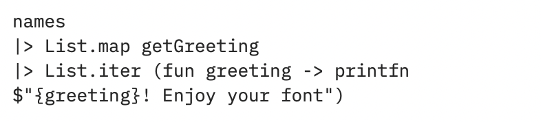
Then, around 2009, Apple started shipping Menlo as their monospaced font of choice, and I moved over to that. It’s not wildly different from Monaco, so the changes were minimal:
I largely stayed on Menlo until JetBrains, whose IDEs I use constantly, released their own typeface, JetBrains Mono .
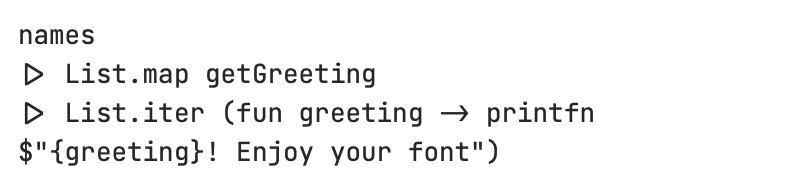
You can see that it was about that time that I adopted ligatures in my programming code. I stuck with that for a while, until I read an article which made me rethink my choices.
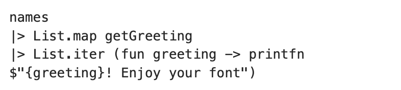
I even played with IBM’s new Plex typeface:
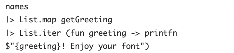
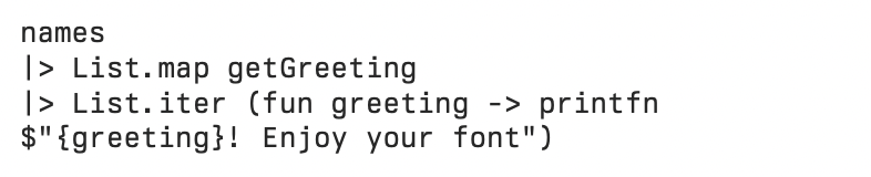
But I quickly went back to JetBrains Mono. That was until that fateful tweet, and with some encouragement from April , I tested and finally paid for Berkeley Mono:
I cannot tell you why, specifically, but the minute I adjusted my IDEs to use Berkeley Mono, everything instantly felt clearer and easier form me to read. Given my astigmatism, this is import.
So, give it a shot. They have a free trial. I know the entire market is flooded with free, or more accurately “free”, resources, but there’s an enormous amount of work involved in creating a good typeface, and like IDEs, people deserve to be compensated for their work.